

How image dimensions relate to page performance
Image dimensions and file weight can affect how much data a page needs to transfer, but resizing alone does not guarantee faster loading or better search performance. Delivery also depends on compression, caching, network conditions, page layout, and which image the browser loads first.
Google's Core Web Vitals guidance defines good user-experience thresholds as LCP at or below 2.5 seconds, INP below 200 milliseconds, and CLS below 0.1, assessed at the 75th percentile. These are page-experience measures, not image-size targets. See Google's Core Web Vitals documentation.
Serve an image that fits its displayed role
Start with the size of the image slot in the page design and the detail the image needs to retain. A very large source may be unnecessary for a small thumbnail, while a small source enlarged for a large hero can look soft. Compare the intended output on representative desktop and mobile layouts rather than applying one universal width.
Use responsive image delivery where the site supports it
Website developers can provide multiple image candidates with HTML srcset and sizes, allowing the browser to select a candidate for the rendered slot and device. Width and height attributes also help browsers reserve the image's aspect ratio space before the file loads. These are site implementation choices; resizing files does not create responsive markup or guarantee that a site uses the right candidate.
Prioritize the image the user needs first
Identify the likely Largest Contentful Paint image and make sure it can be discovered and loaded promptly. Avoid lazy-loading an above-the-fold image when it is the LCP candidate; below-the-fold images can use lazy loading when appropriate. Measure the page after changes because image work is only one part of rendering performance.
Prepare image dimensions with care
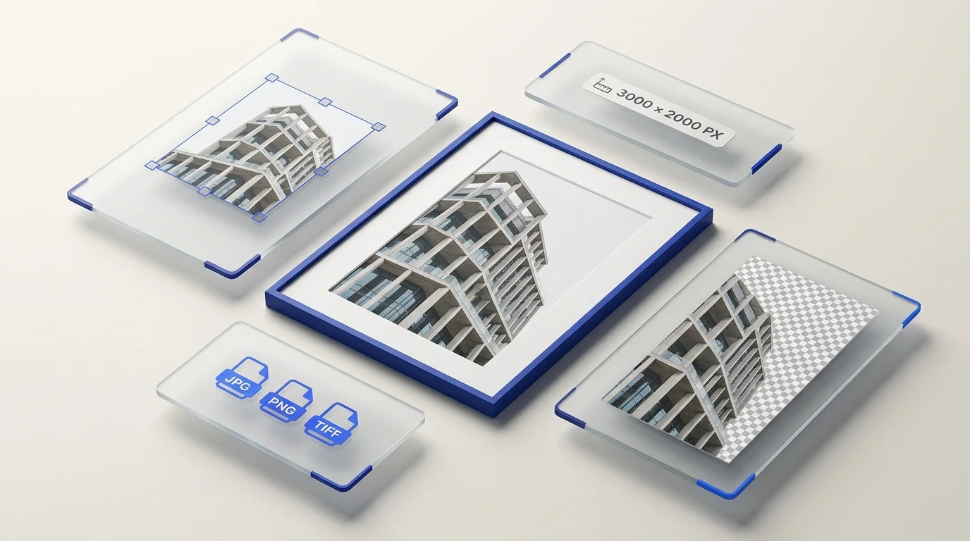
Preparya's batch resize tool can create selected exact dimensions for multiple source images. It does not generate srcset, choose a browser candidate, crop, or add padding. Select a target ratio that matches the source when you need to avoid stretching, and review the output at its intended display size. Use the format converter only when its currently available output options suit your delivery requirements.
For visual-quality considerations during resizing, see how resizing and resampling affect images.